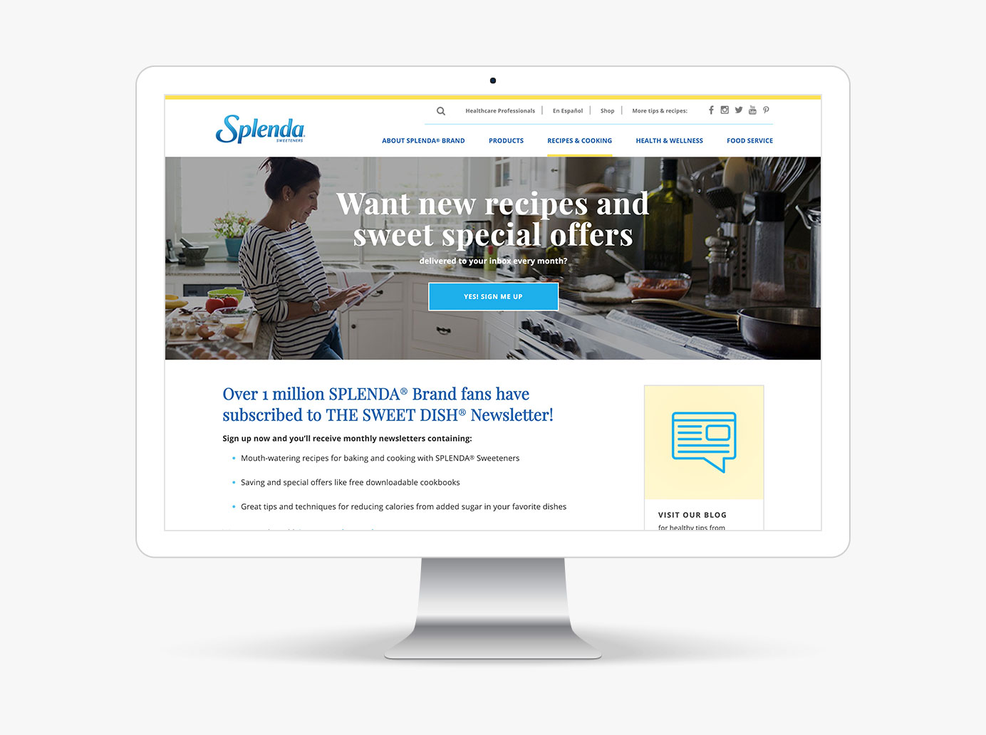
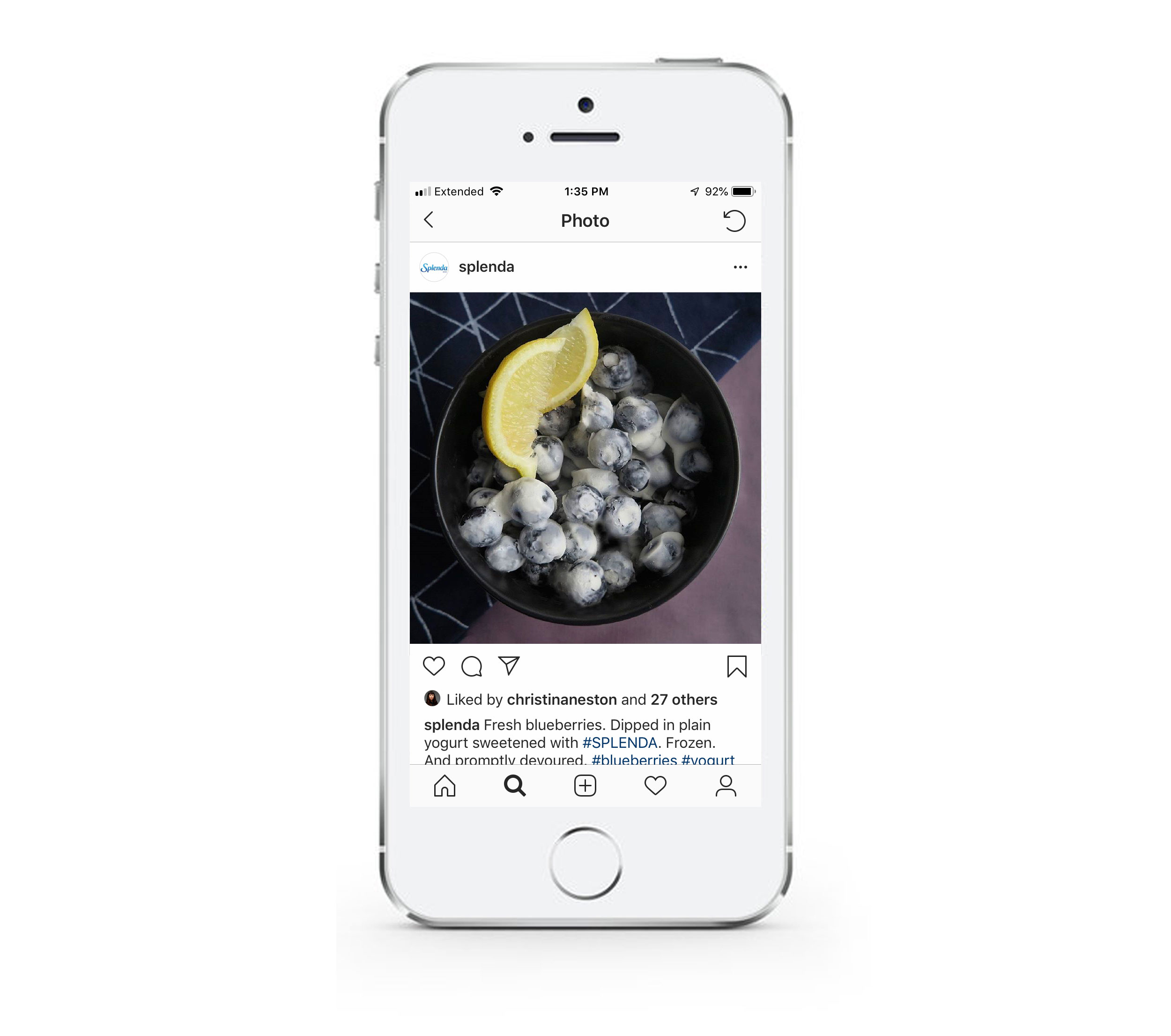
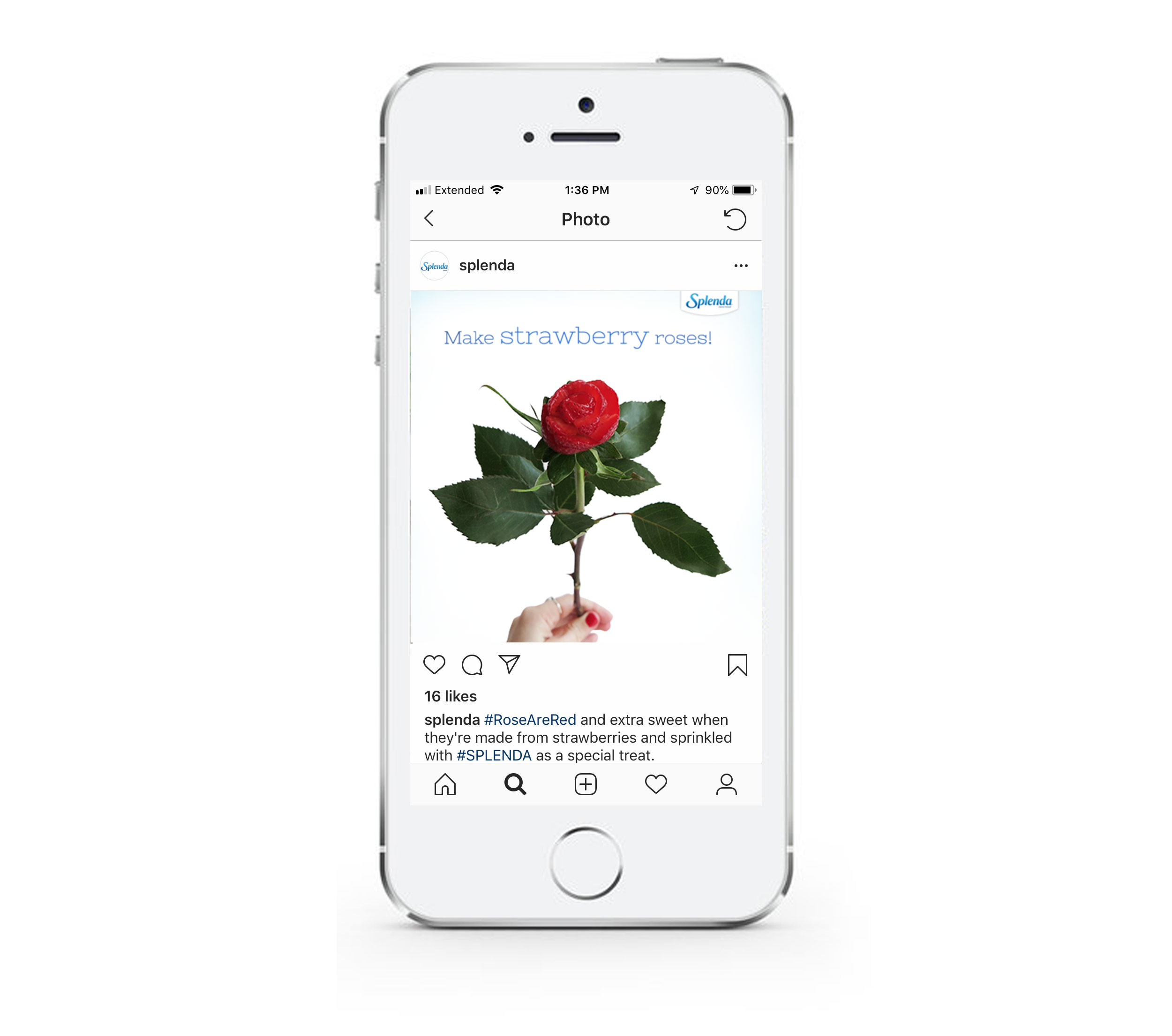
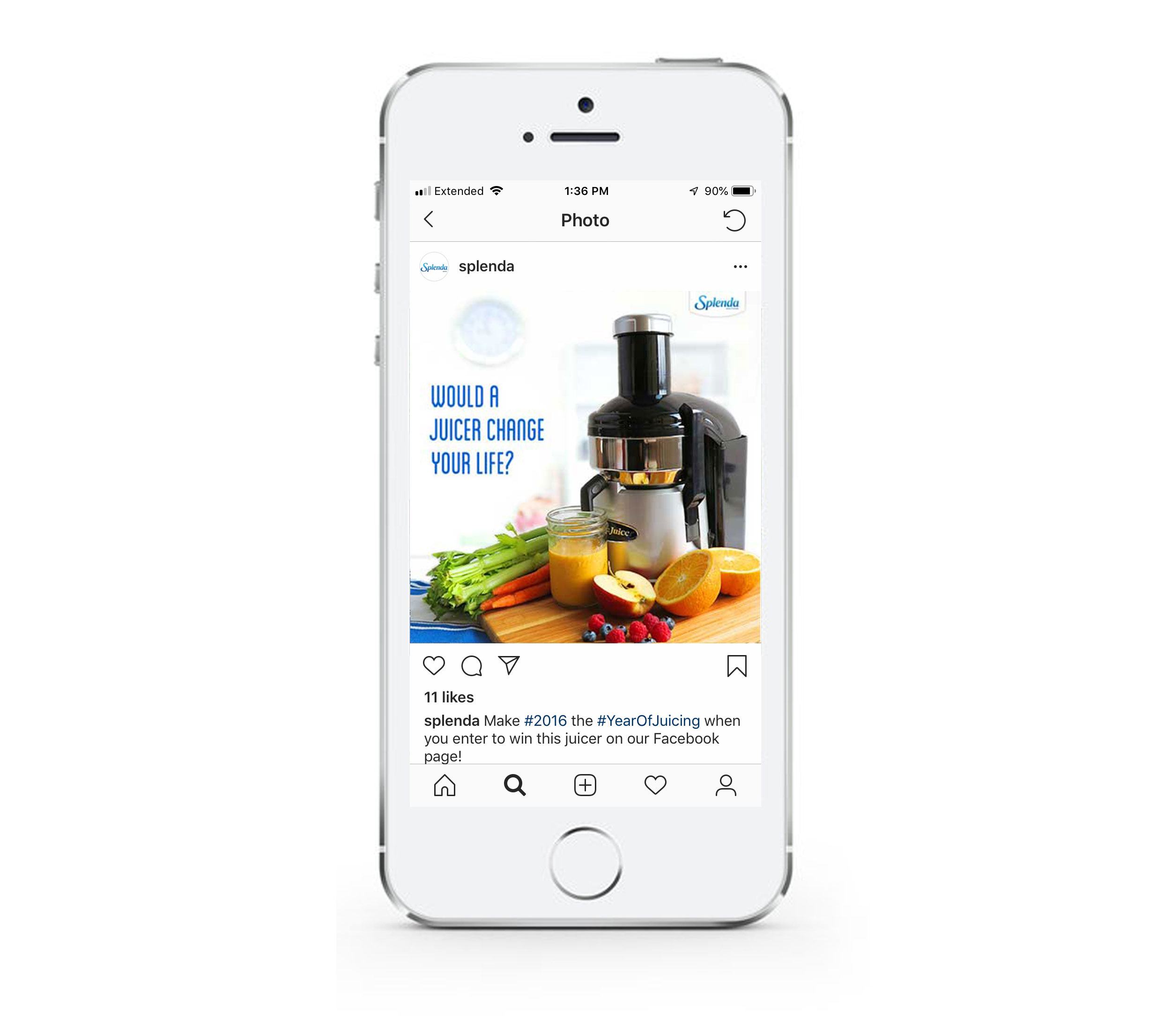
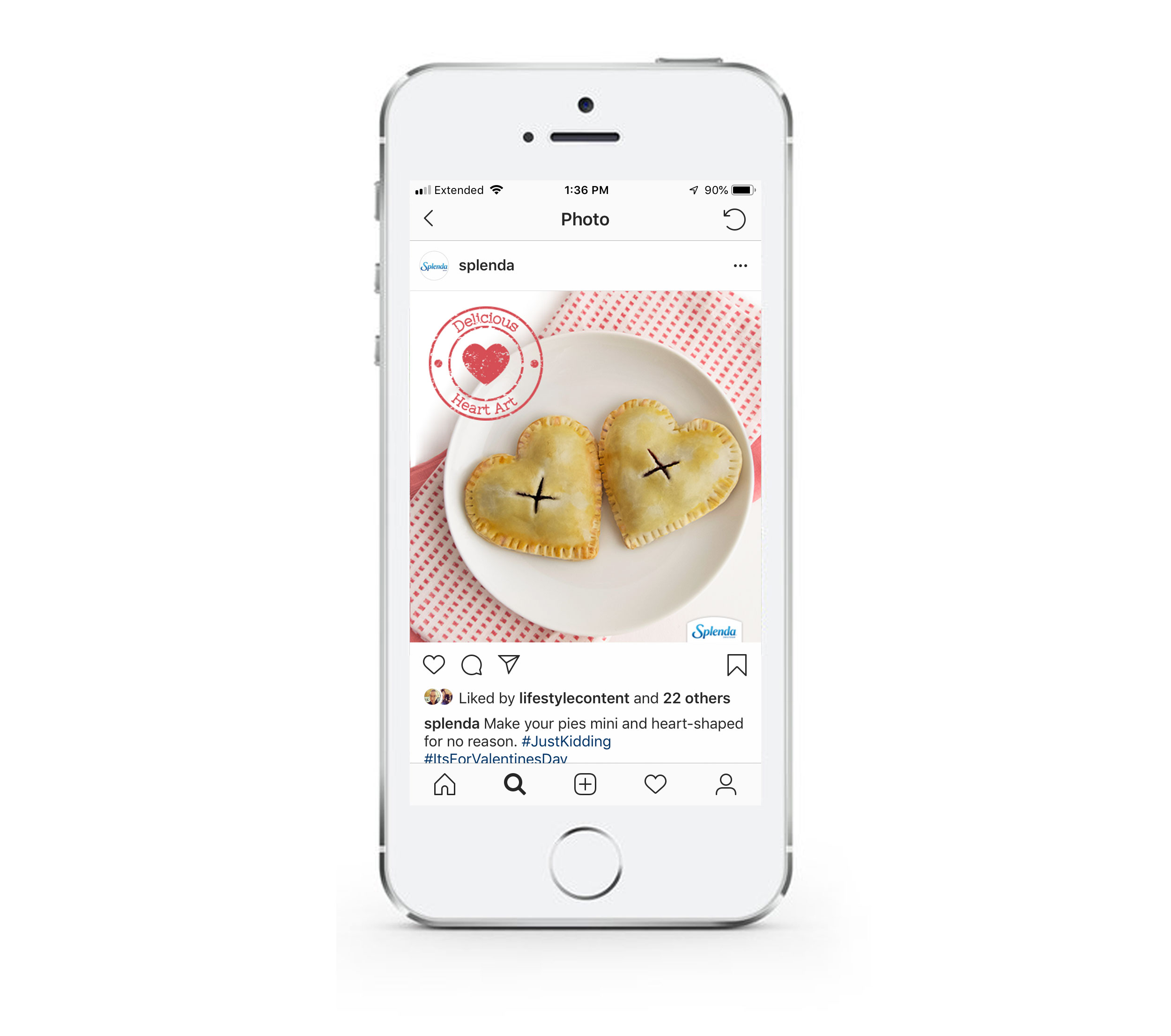
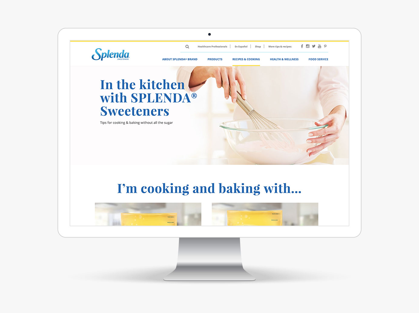
I was part of a small team of designers who redesigned Splenda's website. Our efforts aimed to provide the website with a contemporary look and feel. This involved updating the site map, simplifying user journeys in the e-commerce sections, and incorporating custom animations and illustrations. I led the redesign of the monthly newsletters and also took on the responsibility of styling and art directing the digital food photography featured on Splenda's social media accounts, as shown below.
Here are a few examples of interior pages that I designed. The video is a demo of the FAQ page. The original FAQ page had Q&As about each of Splenda's products in one long, endlessly scrolling page. I decided to create an accordion for each product. The top bar shows the product thumnails and titles, while the accordion below corresponds with the selected product.
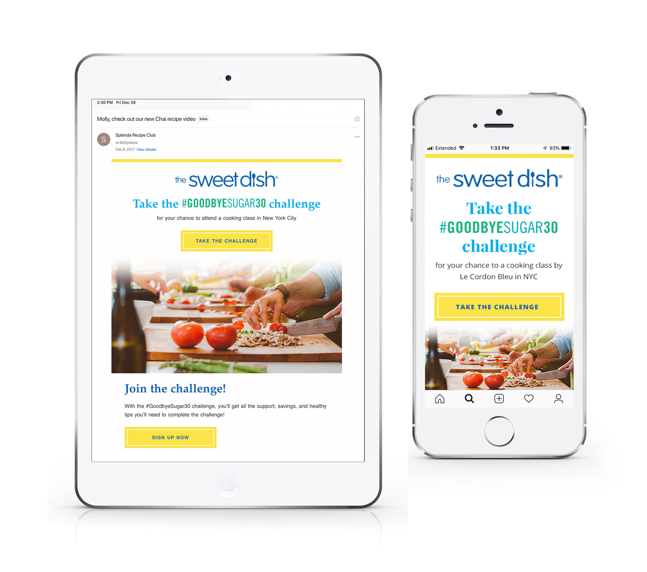
To mirror the new design of the website, I was was the lead designer on the Splenda Sweetdish newsletter template project. I created a responsive template for the Splenda team to use when creating their montly newsletter.
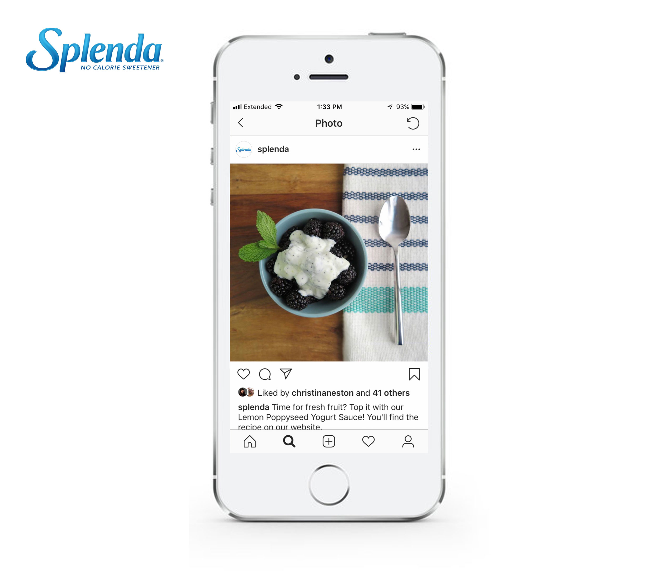
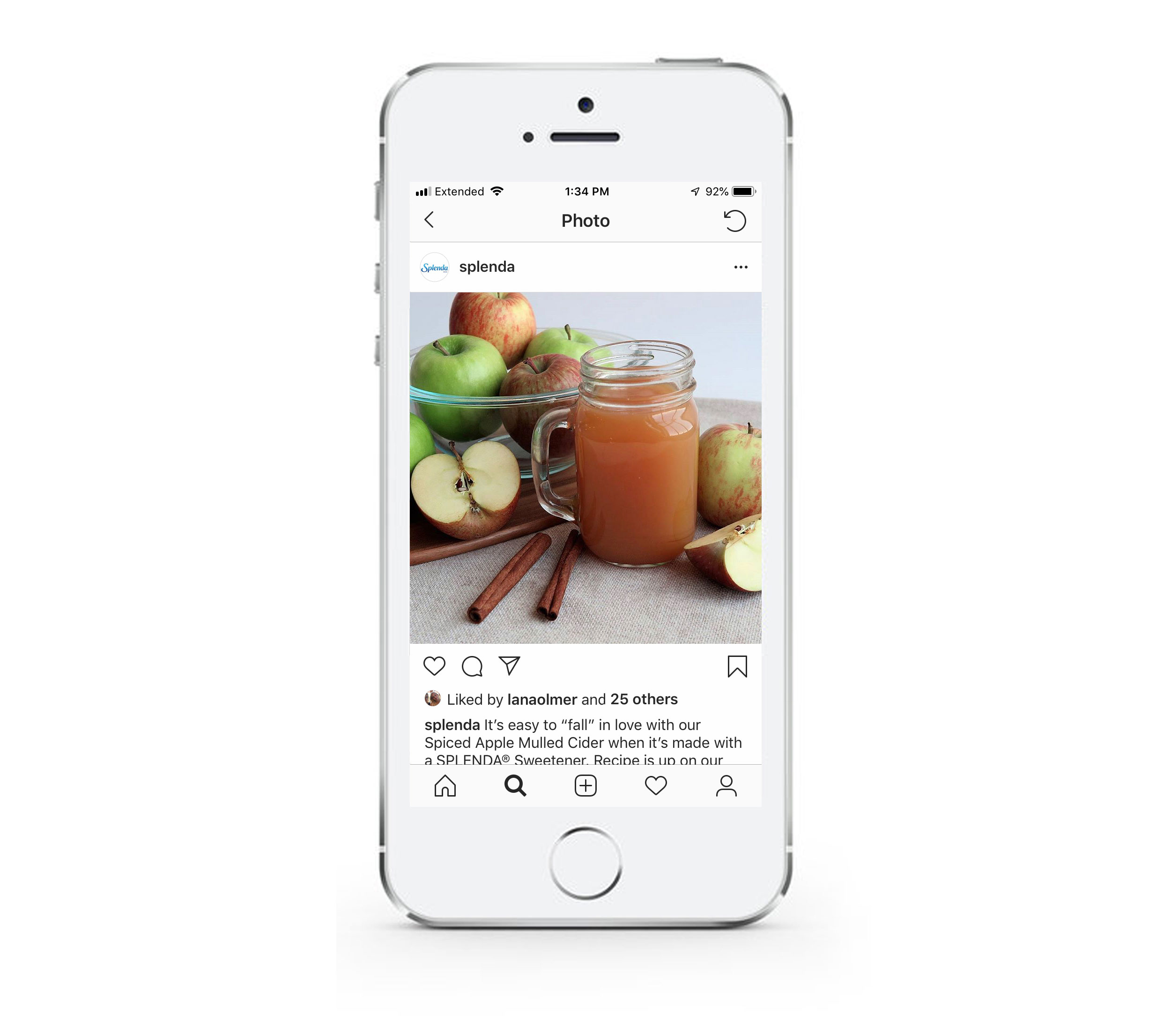
Below are some examples of photoshoots that I art directed, set designed, cooked for, photographed, and edited for Splenda's social media accounts.